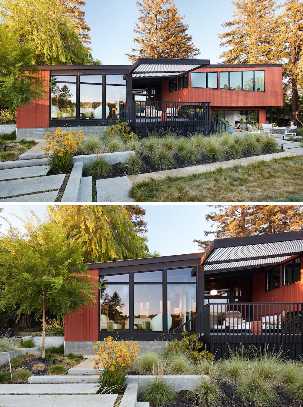
Klopf Architecture has shared with us a renovation they completed of a Roger Lee designed house from 1962.
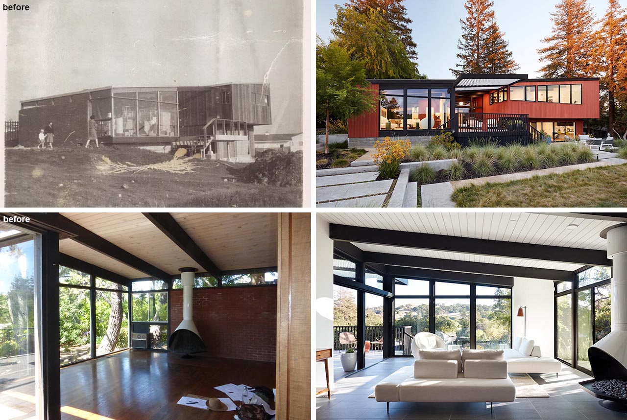
The current homeowners purchased the house in almost original condition, as the previous owners elected to defer most maintenance projects over the years.
The Before Photos
The original home included dated materials and finishes, small rooms, single-paned glass, and uninsulated walls.
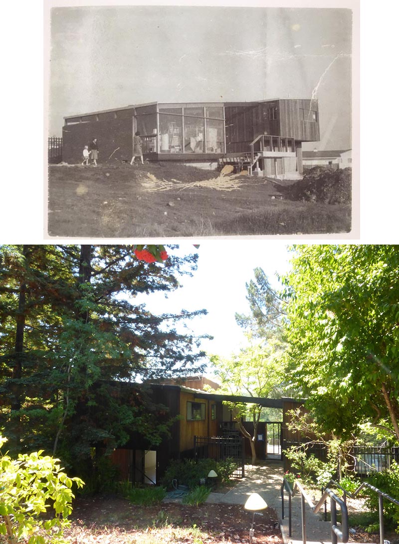
The Updated House
Klopf Architecture designed a full gut remodel and a major addition to bring the house into the 21st century and provide the living area needed for their client’s family. The newly expanded house added just about 1,100 sf to create an airy, comfortable, and family-friendly house.
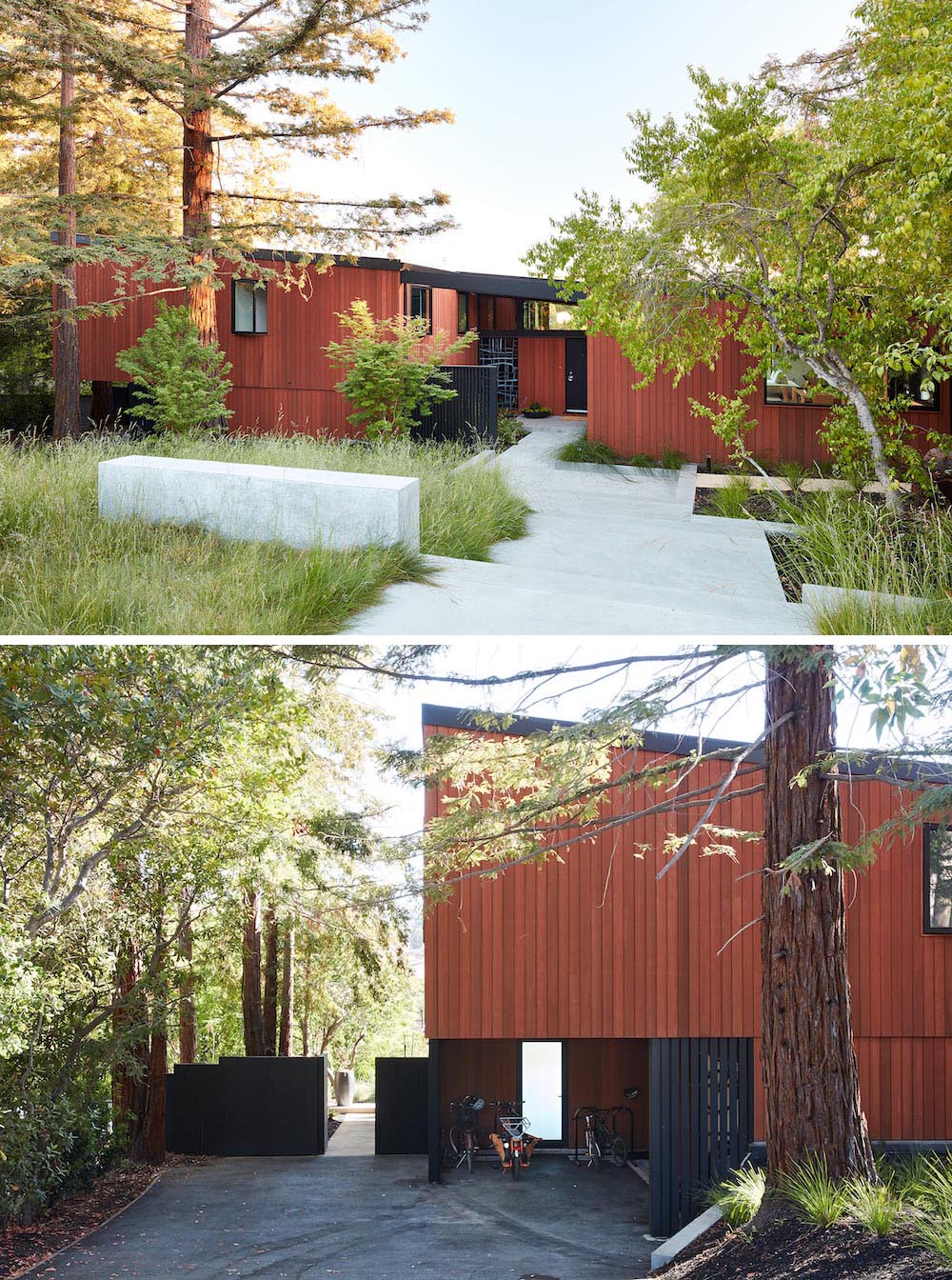
The Entryway
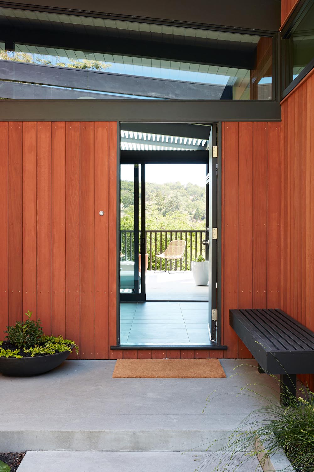
Stepping inside, and the entryway provides views of the valley and multiple benches.
The Living Room
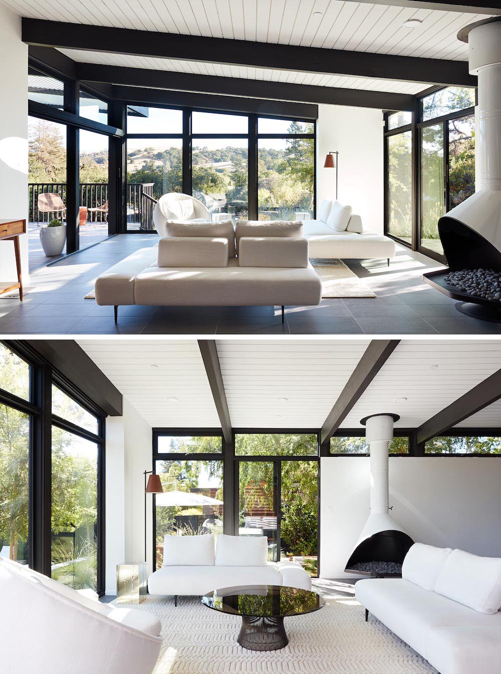
The original wood-burning Malm fireplace was restored and a gas burner was installed to comply with California’s strict air standards. It now rests in front of a wall of Heath accent tiles where a dated red brick wall used to stand. A new taller window brings more light and views into the refreshed interior living room, while the original glass doors opposite the fireplace were replaced by larger sliders
The Dining Area, Kitchen, And Breakfast Corner
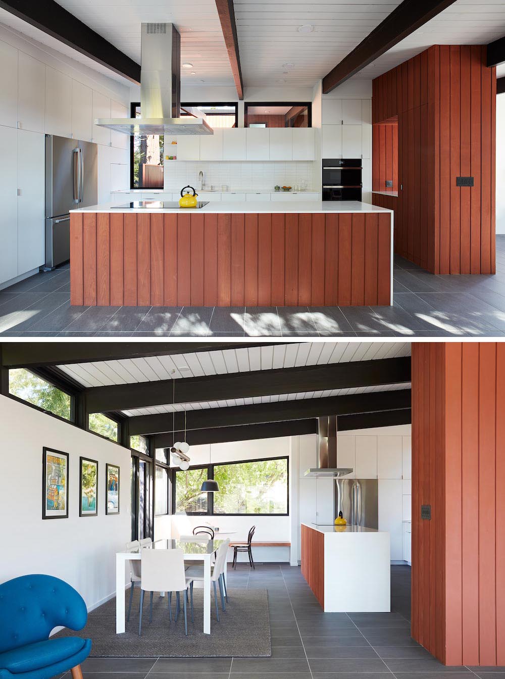
The original utilitarian kitchen was needlessly tucked into the far back corner and closed-off, out of sight from the living room, so the clients asked the architects to open it up and expand the kitchen forward so it felt more connected.
The much larger updated kitchen is connected to the living area where a short wall with a cutout offers a visual glimpse into the kitchen and a handy pass-through counter for serving guests. A new breakfast nook was also added to create another spot where the family can gather for casual meals.
The Stairs
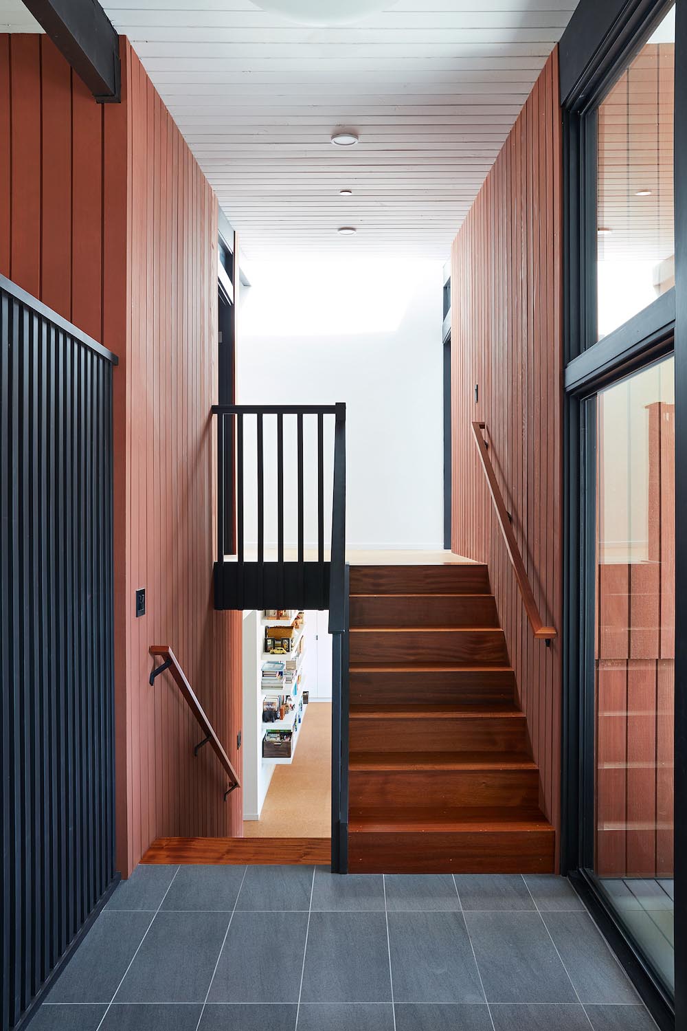
Wood stairs connect the various levels of the home.
The Family Room
The existing lower level was originally designed as a utilitarian space, serving as a wet pool room with a drain in the center of the floor, bathroom, laundry, and storage areas.
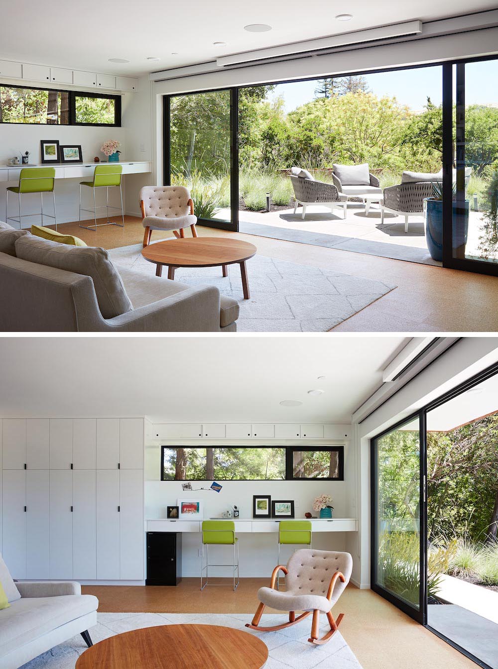
Without the need for a pool room, the architects were able to convert the area into a much more comfortable and functional living space with a new family room and guest suite. The new spaces enjoy easy access to a new outdoor patio through floor to ceiling, full-width glass sliders.
The Bedrooms
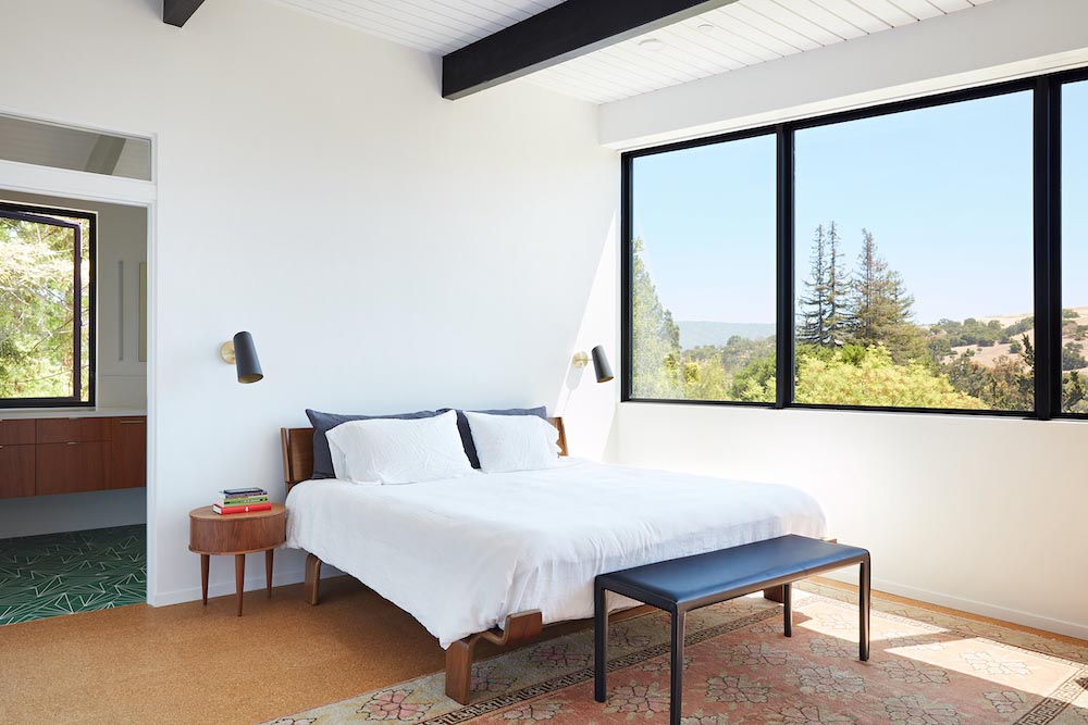
The bedrooms were all updated with bright white walls and ceilings, and black accents. The primary bedroom also includes a small sitting area and desk tucked away into an alcove.
The Bathrooms
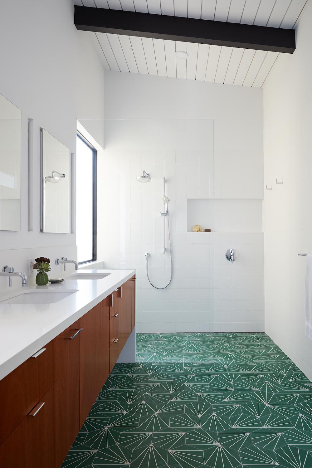
The updated bathrooms include either green or blue starburst tiles, that pay homage to the mid-century design of the house.
The Laundry Room
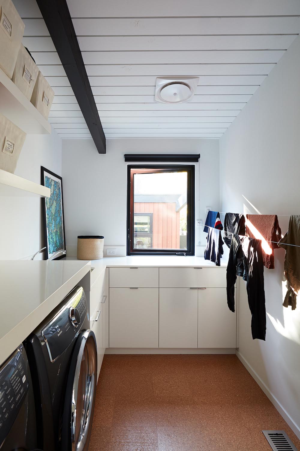
The new laundry room includes cabinetry that wraps around the corner of the room, a countertop that continues above the washer and dryer, floating shelves, and drying lines.
The Rear Of The House And The Landscaping
A cracked swimming pool created an eyesore taking up a majority of the backyard landscape, so it was one of the first elements to go during the transformation.
Working with Outer Space Landscape Architects, the family asked for a mix of relaxing outdoor patio spaces that eventually blend into the native landscaping, extending their views outward toward the natural greenery of the trees beyond their property.
