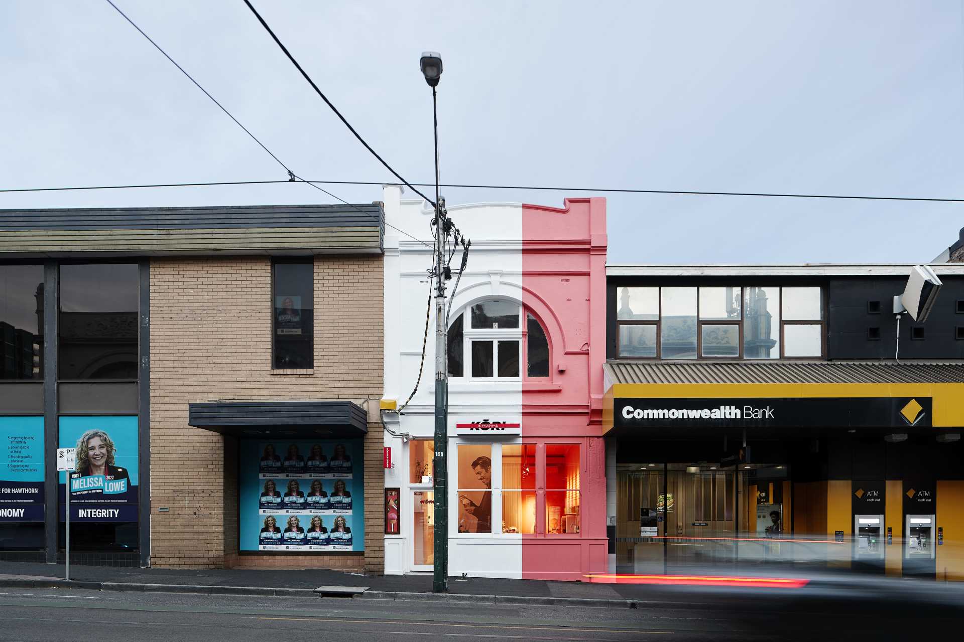
Architects EAT have completed Kori Ice Cream, a fun and colorful ice cream shop with Japanese inspiration that’s located in Hawthorn, Australia.
The designers referenced Japanese kawaii culture and the hyperpop music movement, as well as street art and curbside posters to create a graphically and visually strong space. They mention that “peering into the store is like staring at a poster you might see plastered along laneways”.
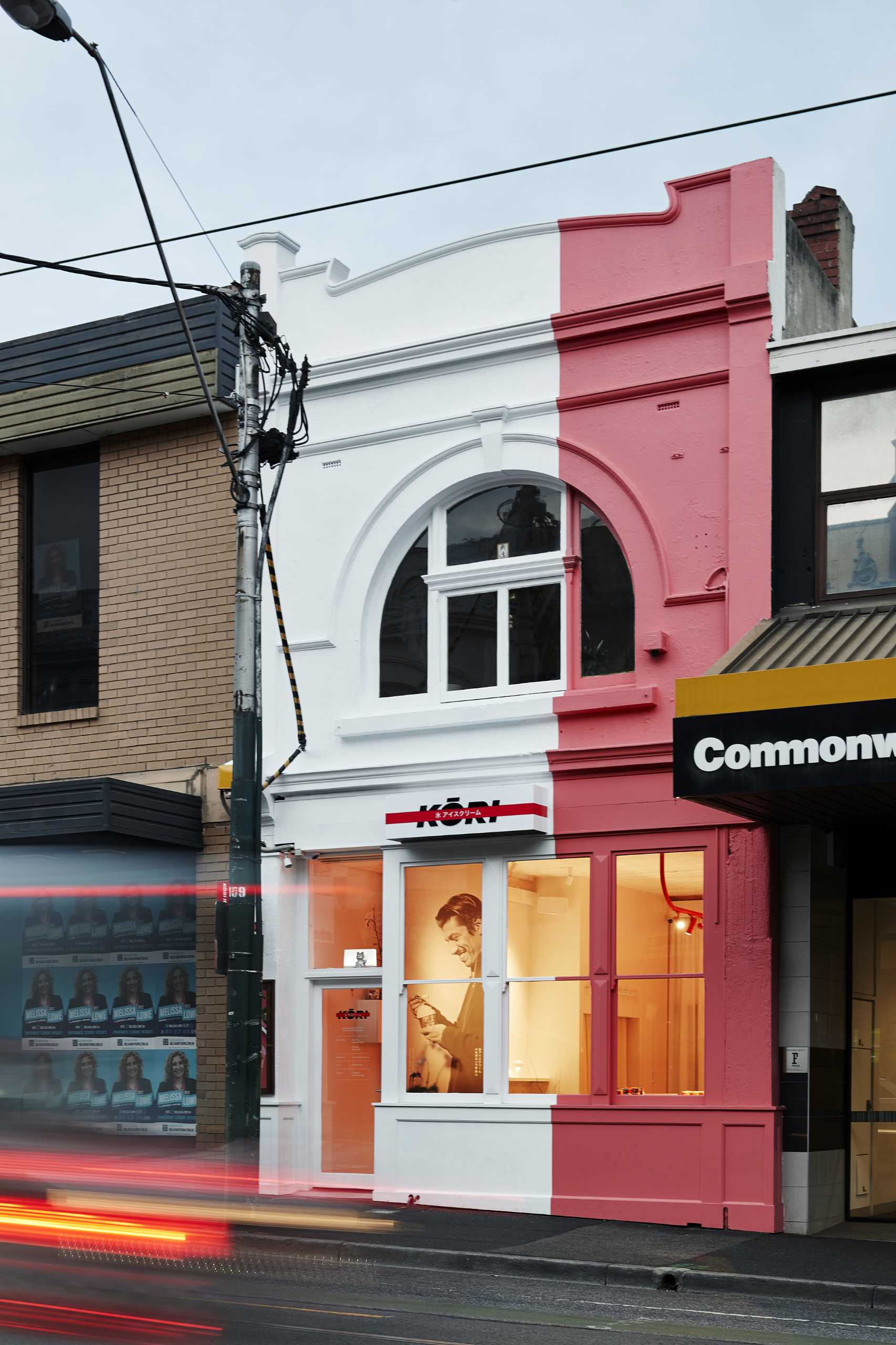
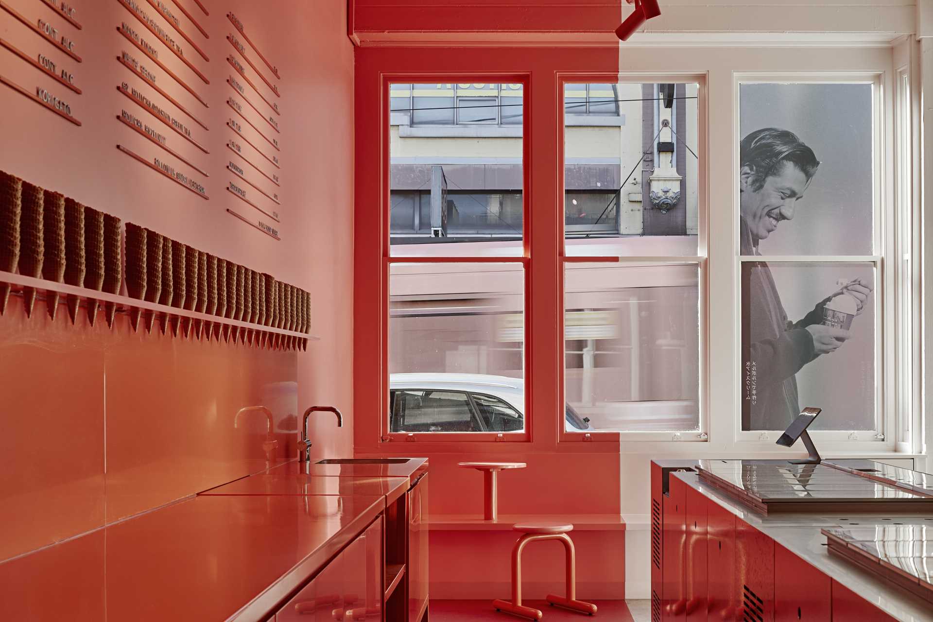
Through the dramatic use of white and pink, the designers created a space that almost feels 2D – like a street poster, and at the same time, appears enticing to people walking past.
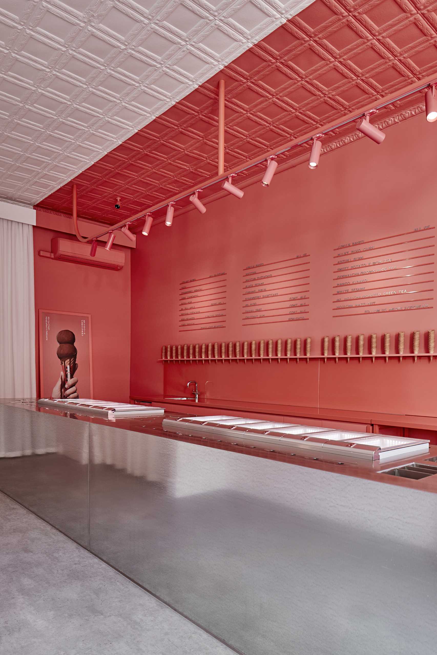
Separating the white and pink zones, which carry through from the facade to the interior, is a large galvanized steel island bench.
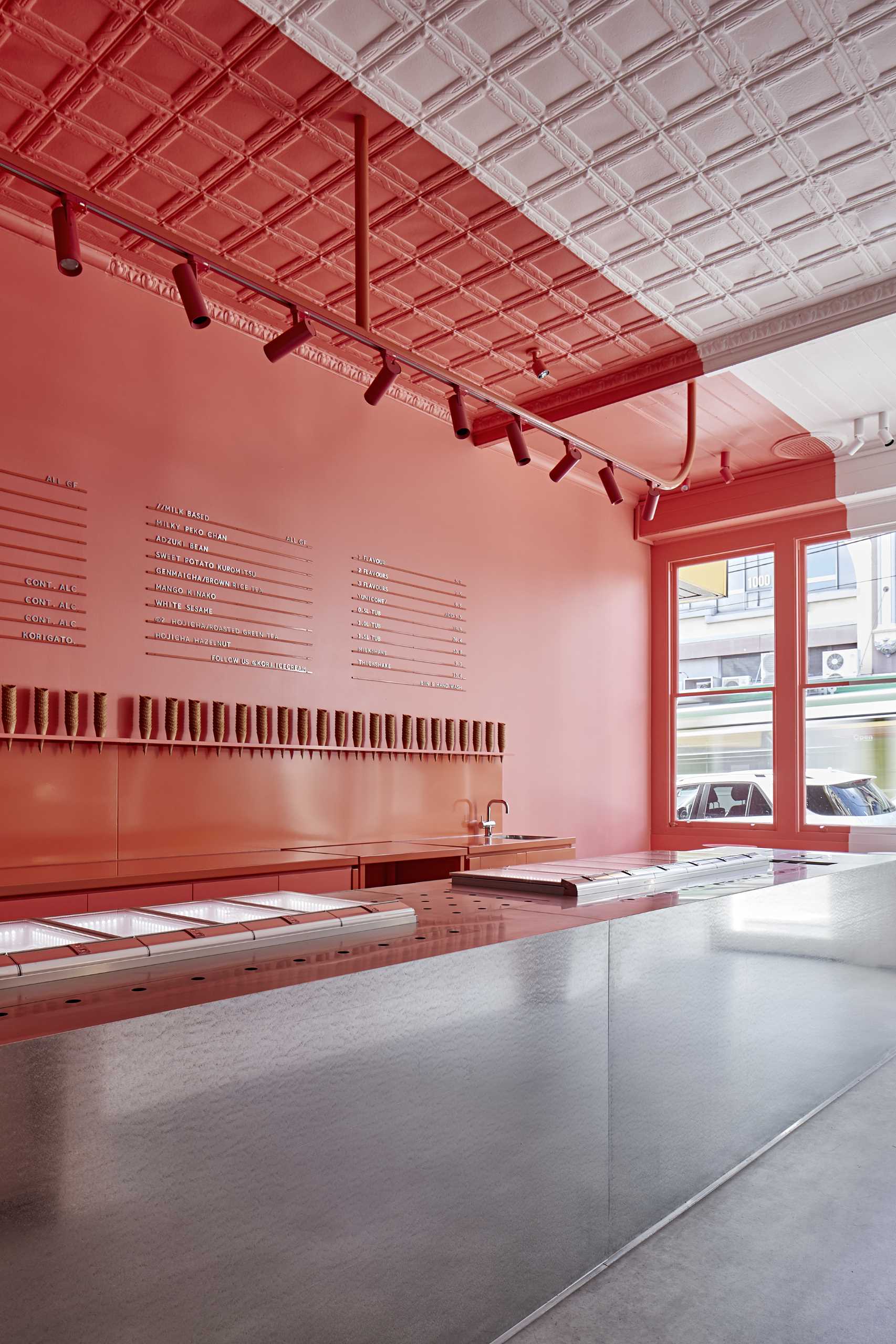
This large island has been meticulously planned to house all the equipment, ice cream, cutlery, electronics, and storage.
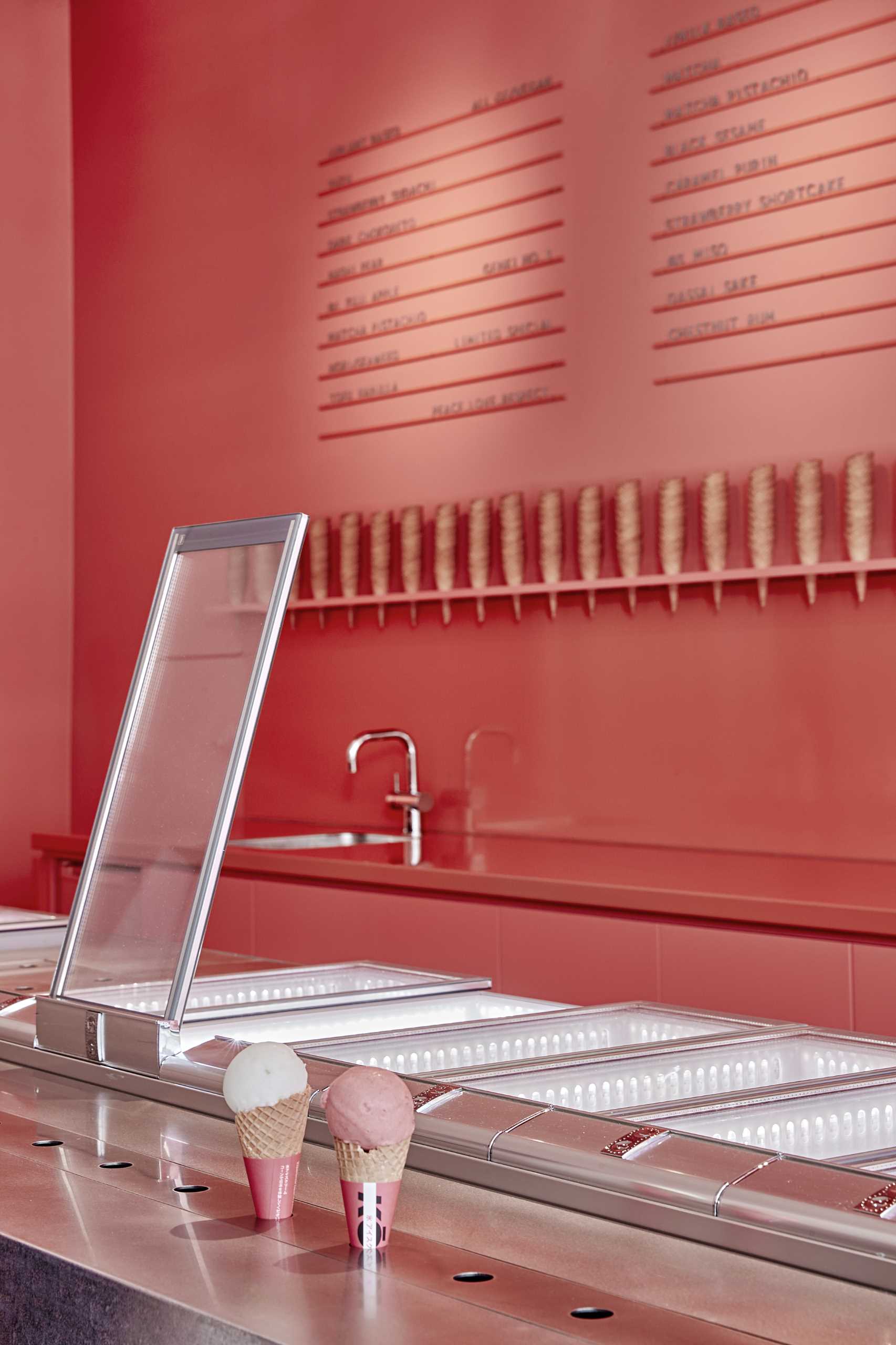
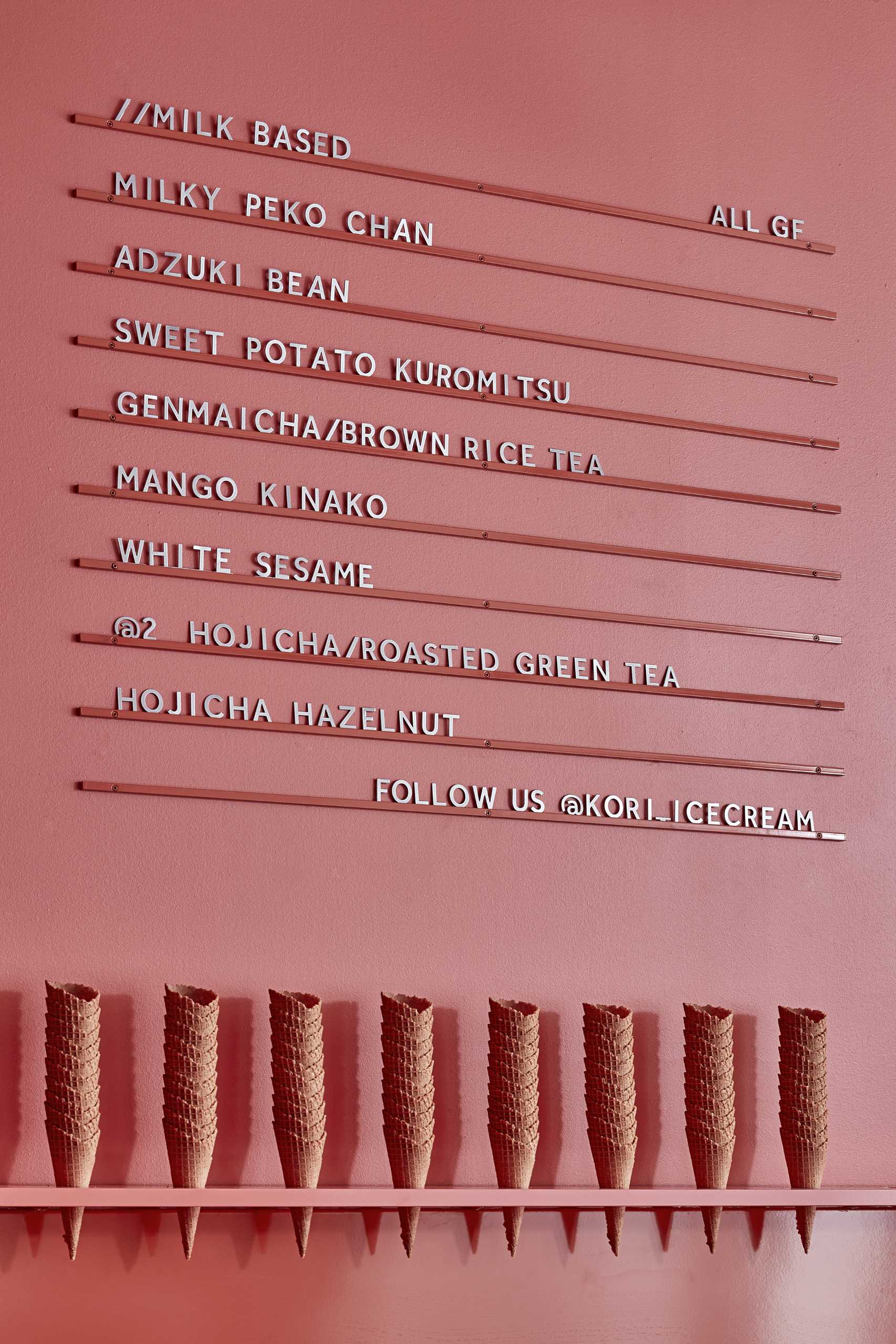
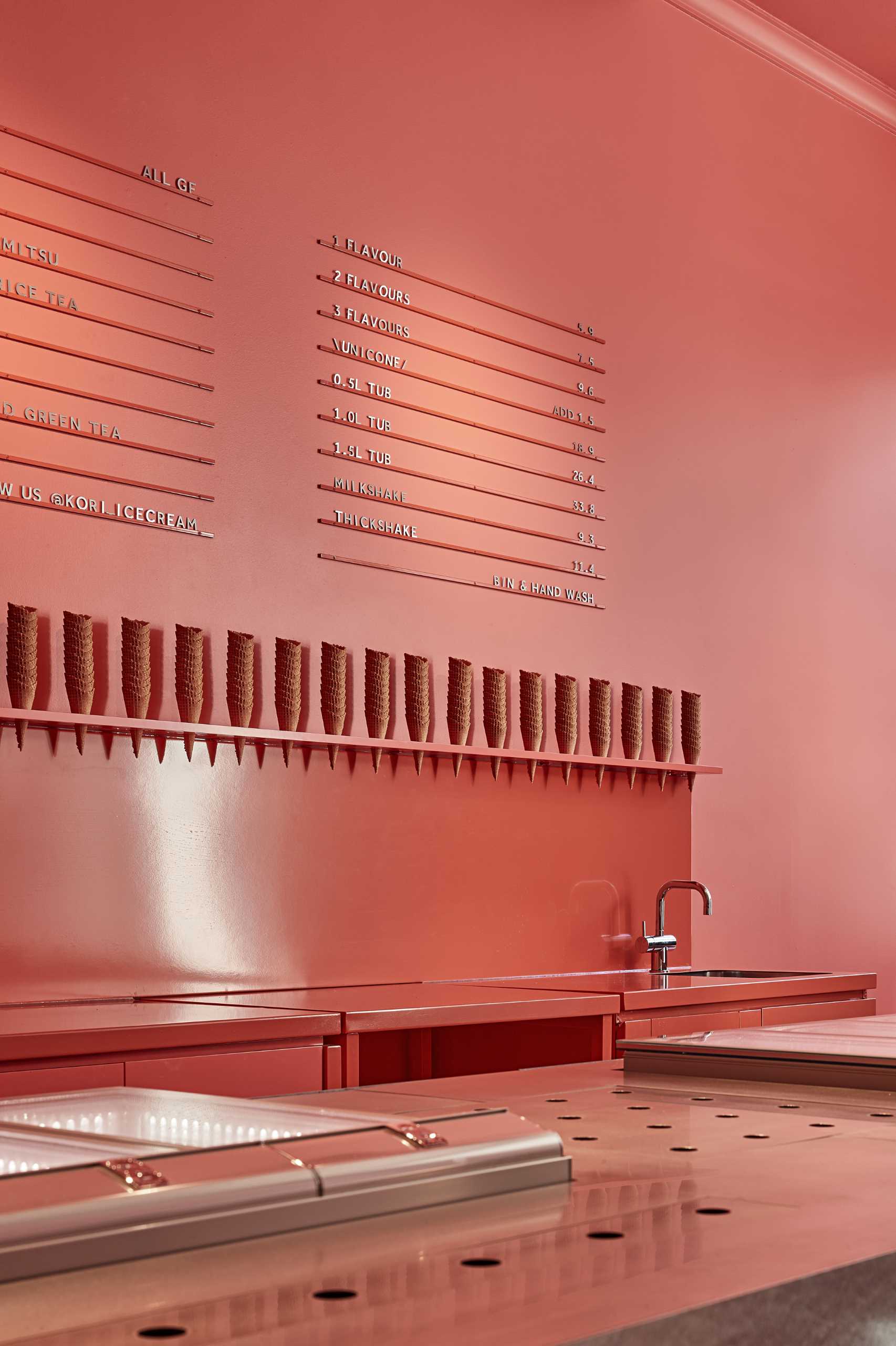
The pink back wall of the shop includes a workspace, ice cream cone storage, and a menu board.
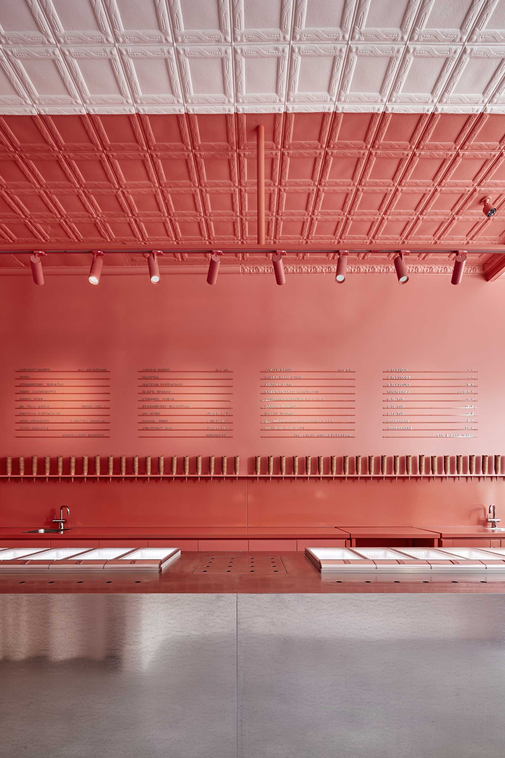
The flavors on offer at Kori Ice cream focus on a traditional Japanese palette with a contemporary interpretation.
.
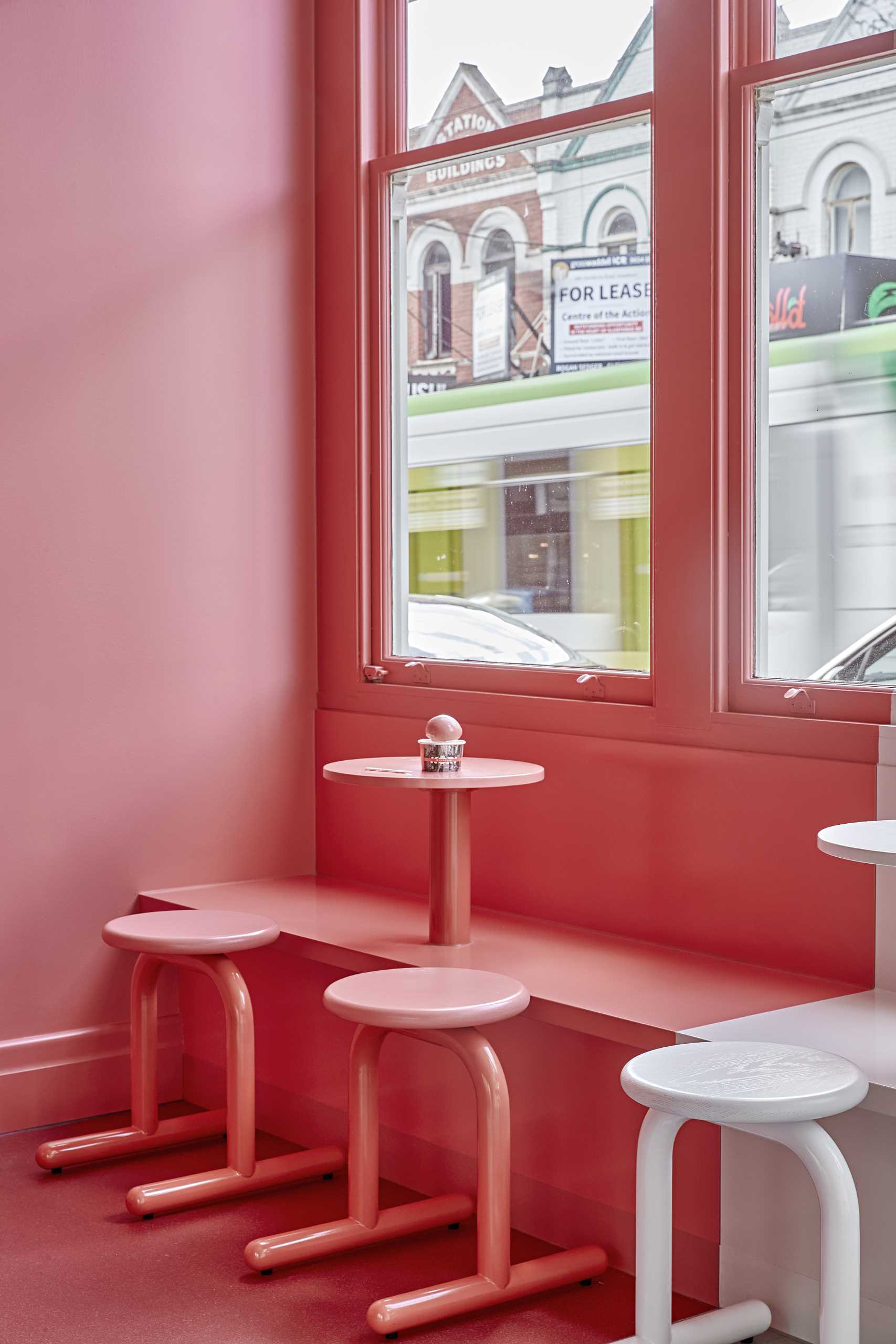
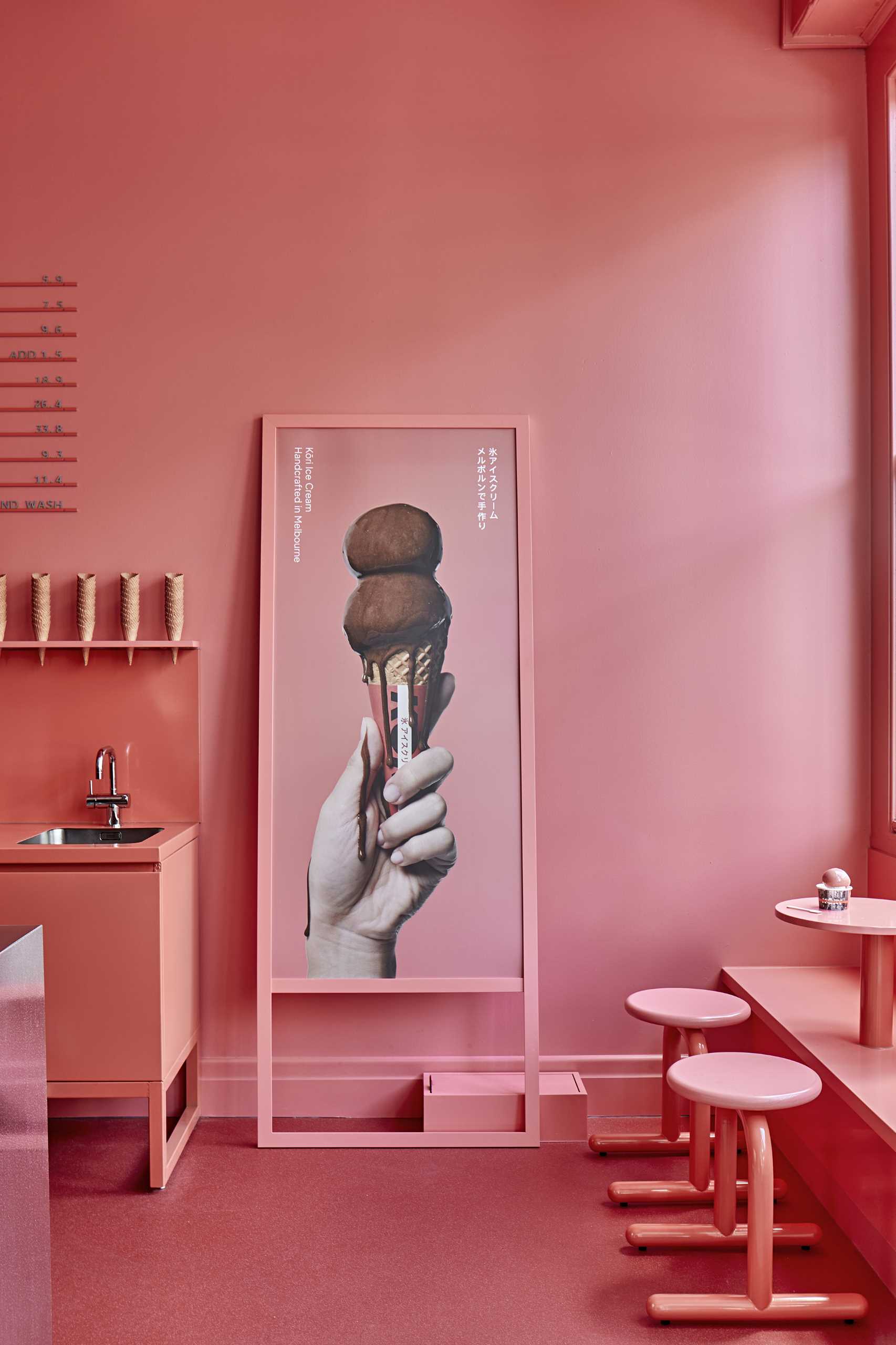
At the end of the service counter, there’s a small seating area with stools, matching tables, and bench seating.
.
.
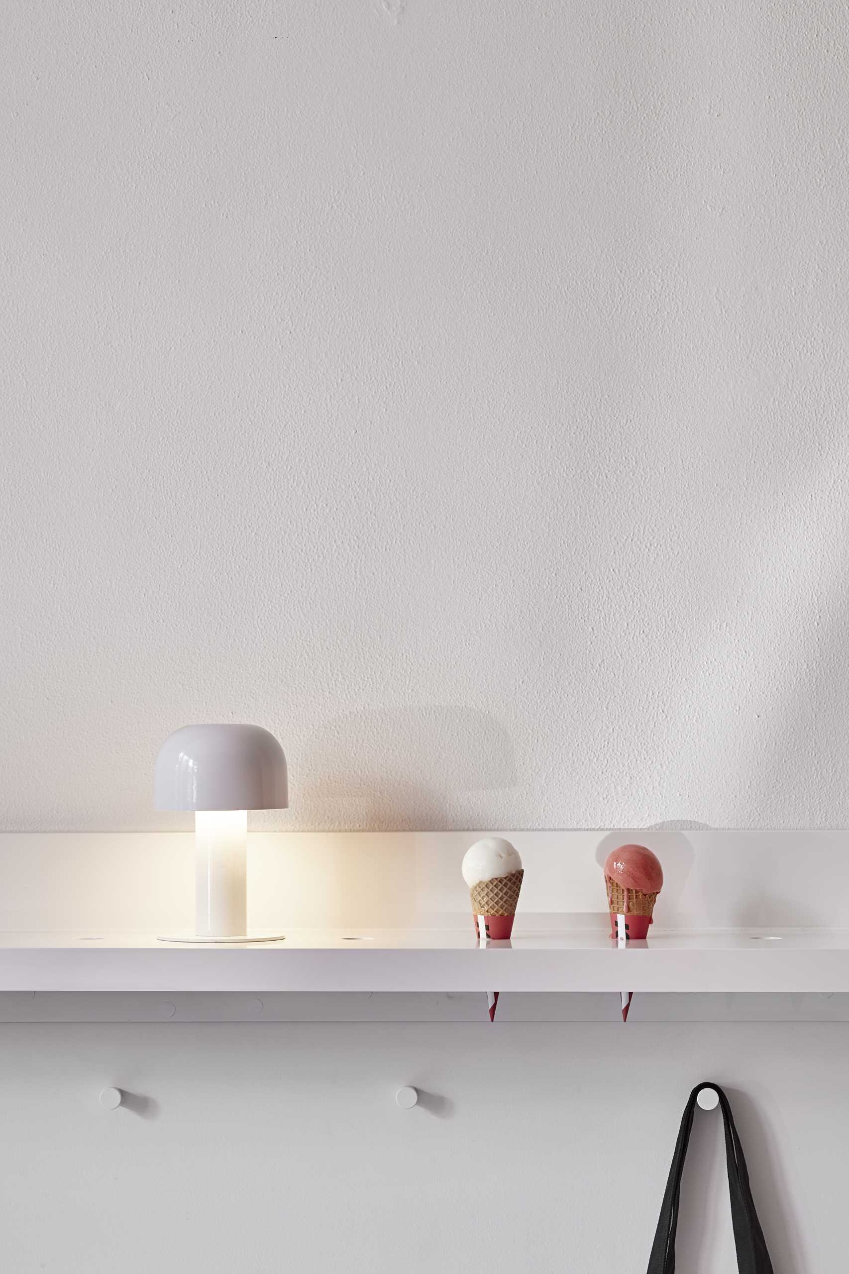
On the opposite white wall, there’s a shelf and a place for hanging bags and jackets.
