Landscaping Rocks: Ideas, Inspiration, & Garden Design Tips
Posted January 30, 2017 by dinogomez
One of the basic accents used in landscaping are pebbles, an intermediary size stone, between gravel and large landscaping stones. Landscaping rocks can add texture, color or be used as an interesting background that makes most potted plants pop and stand out.
LANDSCAPING PEBBLES
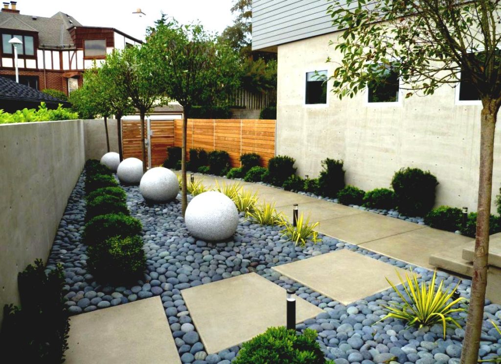
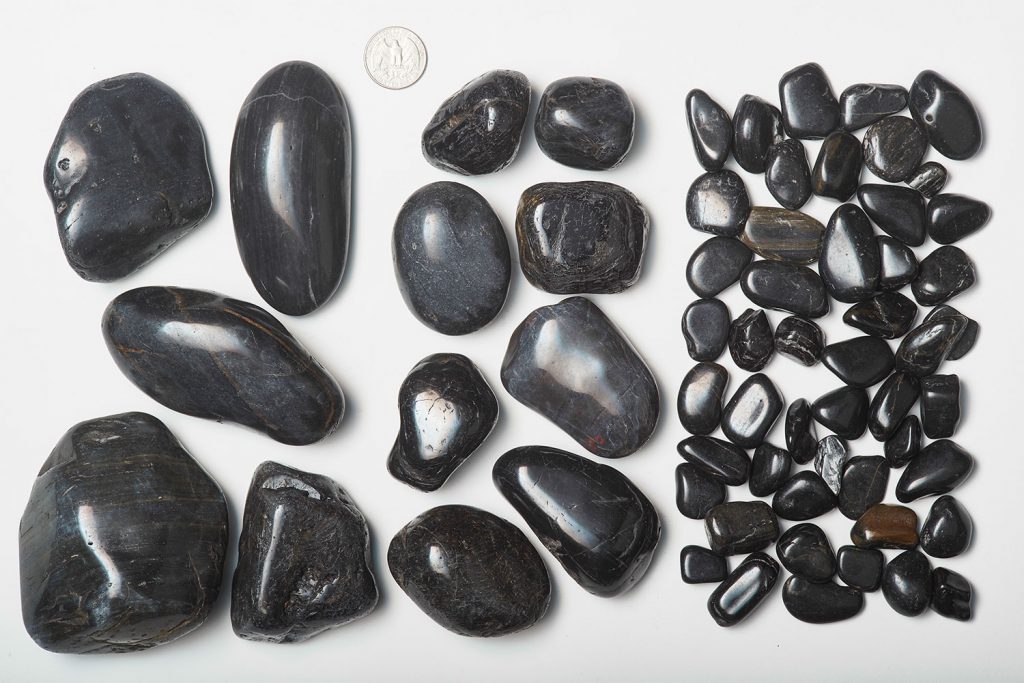
Mexican beach pebbles
The dark tones with the smooth, shiny surface make this landscaping rock a winner for anyone that wants to add some modern tones to their garden.
It’s a “must have” for anyone that wants to go with a Zen garden theme.
The unique combination of features makes these landscaping pebbles an interesting choice for most projects. It’s actually hard not to go overboard and overuse them all over your garden because you can’t really go wrong with them.

You can use them as filler for small sectors between larger light colored elements, or you can use them as borders or frames between 2 flat, boring elements, invigorating the whole area in the process. Another common combination is that of use in tandem with water elements to give you that rocky beach feels, right in your garden.
When it comes to designing some interesting landscape scenes, these landscaping stones are a great element to play with. Their size makes them versatile, and their bold tone makes an impact in almost every scene you use them in.

A cheaper, more accessible alternative to beach stones is pea gravel. You can find it in a wide variety of colors and textures to fit any garden, project or pocket. And if you are picky, you will find a great alternative to the beach stones.
Do: surround your flat-rock paths with it for the added contrast of textures. When going for contrast go all out: Alternate flat, smooth white flagstone with small, dark, jagged gravel for maximum effect.
Don’t: Fill up large areas with it because it’s monotonous look. If used to cover large areas gravel is boring and uninspired. Better than low-quality turf, but still, you can do better. Gravel and most uniform materials become filler very easily.
Do: Clean up your gravel regularly for weeds and keep it tidy because of its small size and weight it tends to jump out and spill over into other landscape elements.
Do not: relegate it to the dark and damp corners of your garden you almost never see and never clean.
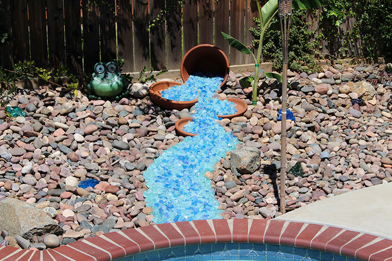
Bahama Blend™ Landscape Glass (Medium ½ inch – ¾ inch)
TIMELESS BEAUTY
Landscaping rocks are timeless. They are an atemporal solution for most ground coverings. That also creates a great metaphor between the seasonal fleeting plant life.
Other coverings like mulch need maintenance and have to be replaced every year at least. Plus, with mulch or turfs, you lose that earthy background that works so well to set a certain mood.
The varied texture and heterogeneous tridimensional look you get from a simple rock bed covered in pebbles can’t be compared to any other option.
Great variety
When it comes to landscaping rocks, you have a wide palette to choose from. Like snowflakes, no two rocks are exactly alike.
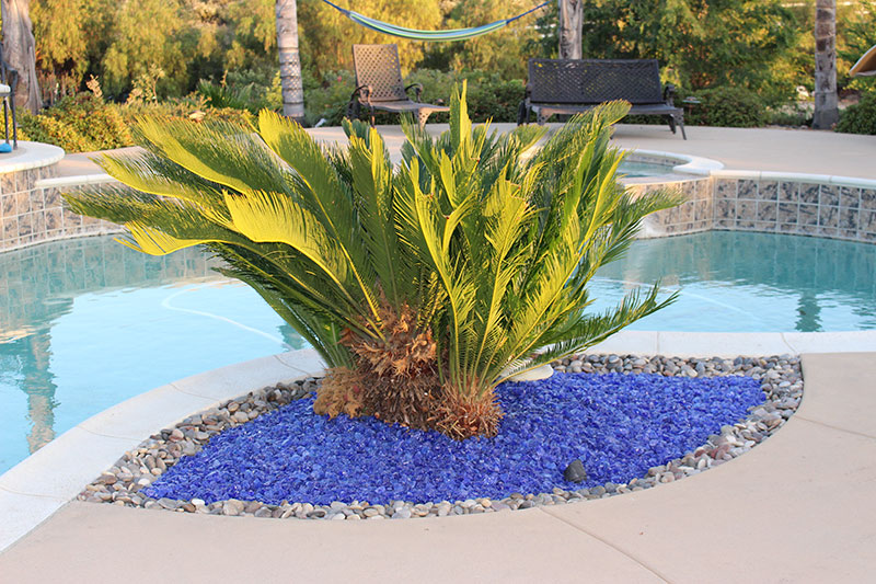
Landscaping glass is a great compliment to rocks and pebbles.
Large central rocks give a feeling of ageless strength. Smaller rounded pebbles can serve either as a counterpoint to the “primordial” rock, to signify youth and rebirth or to add contrast and isolate the central element and bring its features out even more. Your garden your choice in how you want it to look and feel because the possibilities are endless when using landscaping rocks.
Season proof
The next level in landscaping is to anticipate how the seasonal nature of your plants will affect the look of your garden each and every season. This depends on your tastes and the local climate, so I won’t go into specifics. You should have a good mix of spring attention drawing plants, bold summer colors and a heavier, darker, moodier autumn scrubs all on a background of evergreen and landscaping stones for a more restrained winter garden that does not look like it’s just waiting for spring to hit.
I prefer bold textures and high contrasts in my landscaping stones; they help invigorate the winter stage of your garden while simplicity and clean scenes punctuated by bold light colored frames will help you get the most out of the spring/summer/autumn arrangements.
Keep with the theme of your garden
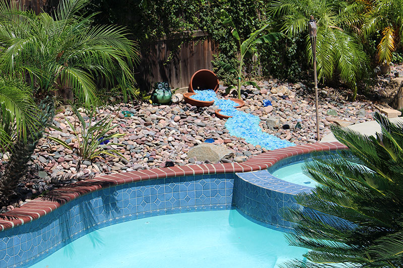
Bahama Blend™ Landscape Glass (Medium ½ inch – ¾ inch)
There’s a right landscape designer for every rock and a landscaping rock for every designer. You just need to imagine it happening. Flat terracotta works with a warm summer arid theme, think new Mexico or Arizona, but not for “cooler,” more minimal zen/fusion themes. I know all this can be intimidating at first, but that’s what I’m here for. And with time you’ll experiment different styles, and I just know you’ll find a personal style that just resonates and feels right.
Pacific-islander/minimalist modern is a good starting point. It’s a simple composition, you have plenty of examples online. It’s sparse and hard to overdo.
You can easily recognize the style by the elegant and refined dark sea stones/beach pebbles and simple, minimalist scenes. This is a great choice if you want a timeless garden that will feel fresh and stylish many years from now across all seasons.
FUNCTIONAL DESIGN
Another way you can go with your design is that of function orientated design. This is how I got started. I’m a practical person at heart, so functional elements are the basis of all my projects. So if I’m going to do something, why not make it look great.
For example, rockscapes are great foundations for most pot plants. They permit all water that drains from the pots on your deck or patio to drain easily without gathering too much moisture and breeding fungus or mold, keeping your garden clean and hygienic. No reason why you can’t point out that function with some contrast. Use bright, textured larger gravel, so the effect isn’t easily overlooked. Congratulations, you just made your first design choice, you are officially a landscape designer now.
Carving out a path for yourself
Next step (pun intended) is to think about how people will get to your plants. A classic element you need but gets neglected by most people is a path. Paths are functional elements that you can make shine or make into the center point of your garden; they open up your garden to exploration and enable you to immerse yourself in the greenery without getting dirt or mud on your shoes in the process. This makes the yard more accessible without ruining its natural look and feels by introducing artificial materials like concrete.
A very popular interpretation of the garden path is again using contrast, but the contrast of texture this time by alternating between small landscaping pebbles and larger foot size stone tiles. They should be similar in color but different in intensity.
Always use irregular shapes, I’ll explain why further down in this article, for the time being, just trust me.
I prefer larger tiles that are one or two shades lighter than the surrounding pebbles, so I also get more visibility on the texture and grain of the tiles, while still having the contrast and separation of their surrounding. But it’s not a hard rule, experiment and sees what you come up with.
Alternatively, you could make a path out of some interesting, unique gravel and enjoy that soft, silent crunch under your feet that gives your garden another auditory dimension. Alternate gravel color and/or size for a bold break in the visual monotony. Be warned however as this will make for some shocking visual effect, take care to not overcrowd the scene with other bold elements or random patterns.
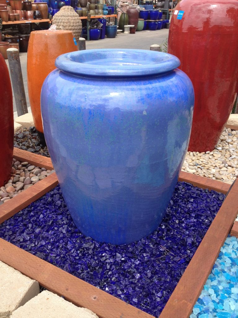
Ocean Blue™ Landscape Glass (Large ¾ inch – 1 ½ inch)
CONTRAST IN MODERATION
Since we’re on the topic of crowded visuals. I’ve been talking a lot about contrast, it’s the most simple and one of the best design tools at your disposal so at this point I think we need to talk about when it’s too much.
Your message, the visual impression your work makes like all messages need to be clear. Each and every visitor to your garden should do what you were going for. Sandy flat steps in between dense red gravel, a clean, smooth pool bordered by rugged, jagged walls, a lush palm tree in a frame of sandstone, a central jagged rock that looks like was chopped out in the later critic, surrounded by smooth, dark, shiny river stones that resonate modernism. The picture needs to be clear and require no explanations.
Every scene, every frame the eye takes in, should have one contrast, and only one. When dealing with a smaller crowded garden, exercise restraint, have fewer scenes, but those that you do have a need to be clear and obvious.
Some classic directions: smooth vs. jagged, cold tones vs. warmer colors, shiny but lifeless vs. matte and dark greens, dense dark green bushes on top of limestone white walls. Small vs. big, dry vs. water, fire vs. water elements.(this one is a sensational combination if you can pull it off, and very trending as I see this combination increasingly year after year)
BACKYARD BEAUTY…
A more particular implementation of design, it has to do with composition. The human eye gets bored fast with continuous surfaces, lawn, a scrub wall or green corner. The eye tends to just glance over continuous spaces of uniform texture and color. Now if that happens a couple of times in a row, the brain just moves on to something else, and your garden will be perceived as generic, forgettable or boring.
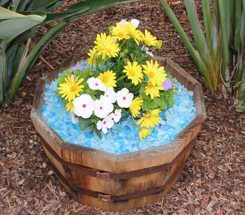
Bahama Blend™ Landscape Glass Large (3/4 – 1½ inch)
Accents are counterpoints within or around the surface of greenery or gravel. They keep the eye focused for that millisecond more, so they get to take in the full complexity of the frame, the details of the background: the lushness of the flower wall or the color of the gravel pathway. Do this a couple of times in a row as the eyes move from scene to scene, and you created an experience in their minds.
Your garden becomes a unique space in their mind with a personality, a theme and an atmosphere. It is an experience that needs to be seen because simple words or descriptions can’t do it justice.
Landscaping Centerpieces
That being said, you can apply this principle on a macro level. Landscaping rocks don’t need to be relegated to just mood devices or good background elements. They can be the focal point of your landscaping. Unlike living centerpieces, a large unique, eye-catching boulder will give your garden continuity across all seasons. And will bring together larger spaces and unify them around an equally large focal point. What was once acres of repetitive segments becomes an expansive garden unified by the central element.
Terra Cotta firepits
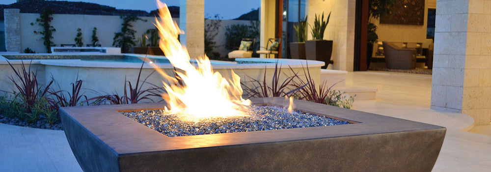
Another amazing centerpiece that also happens to be functional is the fire pit. A fire pit will make your garden an intimate nighttime destination, a terra cotta chimenea will add a bit of South Western flair to your garden and also give it another dimension, whether you use it as a central gathering point for warmth and light or let it just hang in the background for ambiance. A firepit will never be completely ignored. I’ll stop right here because firepits deserve a whole post just for themselves.
Borders and Frames.
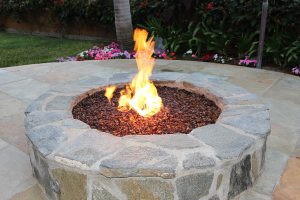
Outdoor Fire Pit – Amber Fire Glass (Small ¼ inch – ½ inch)
Similarly to the unifying role, large centerpieces offer at a macro level, macro design can be done with the bold, clear definition of certain scenes. Here’s where landscaping rocks are essential. Landscaping rocks can improve existing elements at the micro level and set the mood, the theme for the whole garden. Just by using the same type of granite accents all over your garden and adding a water feature your garden becomes a unified homage to the rocky ocean cliffs. Use dark tones for northern European cliffs, gray tones if you want to go for a French look or sandy tones for a Spanish, Mediterranean look Algarve style.
And it goes way further than that. I saw the seamless integration of tropical with colonial or Pacific Islander with North Western Victorian.
DO you have a dark pond that just looks meh, next to the dark green foliage surrounding it? Border it with light stones to make it stand out and be more defined within the environment.
Do you have a lawn that is boring and uniform, that just looks so and so… Add stones in a random pattern, so they break the monotony and move your gaze in interesting and unpredictable ways.
Use the same type of landscaping stones in both frames, and they come together as if part of the same environment.
Size is not important in this case, but the landscape rocks need to be interesting, shocking almost. Go with strong colors or a rugged, irregular shape with jagged edges for maximum impact. The brain needs to be constantly reminded that it’s one environment, one type of rock, regardless of other impressions, that needs to be constant.
Leave the eye no recourse but to travel across the landscape, in interesting, unpredictable ways, across all of the gardens, but never feel like they are looking at another type of environment. The landscaping stones need to be interesting so you know it’s the same environment, but not overshadow the individual scenes.
A great spin to this tactic is to reverse the elements for cases when you really can’t avoid a large area that has the same elements. For example, on a long winding monotonous path across different rocky backgrounds, you should add potted bushy plants every few feet. In this case, the unifying element is the plant life.
Plants are not as easy to differentiate, however, especially when not in bloom so get something with very particular and obvious features. Again, leave no doubt in the mind of your visitor at what your intent is.
COMPLEXITY, TEXTURE, AND DEPT
The difference between sand and gravel, or between a lush palm row and a maze wall is made by texture. Most people just take into account color when creating a scene or set piece. But our eyes don’t perceive colors mechanically; we see it as an element of a more complex image. The other element is texture.
This is why landscaping stones are such a powerful tool in the design and can change the look and feel of your garden so drastically. No other element can infuse mood, personality, and emotion in space. It’s almost instinctive to react to the rocky texture and feel something.
Also, as I mentioned before there’s so much diversity of texture that you will never be bored and your creativity is the only barrier in what you can achieve. Each rock is different. This can be intimidating, but don’t worry, there is no such thing as perfect. Just have fun, mix, and match and stop when something pops out at you.
I recommend you start with something bold and then move everything around, so the scene doesn’t become too crowded. Start out with at least some granite walls or steps….or if you feel a little bold some heavy ironstone centerpieces.
Think 3D Landscaping
One of the boldest ways to invigorate and make your garden step out of the norm is to add another dimension to it. Adding layers and height is usually the easiest. Large boulders, walls made out of some “rocky” landscape bricks are a good starting point. When adding dimensions, like with any accent, go big or go home. Make an impression and then downscale the rest of the garden to fit the new style. Visitors should never be left wondering if that large rugged boulder in the middle of your garden or if the 10-inch deep garden-wide rock step is an afterthought or the main event, but they also should be overstimulated by tens of shocking features.
Armour stone
This massive landscaping stone is great for adding visual complexity and creating a seamless change in height in your landscaping. It gives the impression that any transition is just carved out of a primeval clift. This works great for stone steps that become a feature of the environment instead of man’s will.
Its crusty texture makes it amazing for a contrasty integration of pools, that can look very out of place otherwise, in a natural feeling garden or yard. There’s just something flat about the look and feel of most water features. Mind you this can sometimes be good if you are going for that particular look. But most people aren’t, and a rugged landscaping rock is a great intermediary between the natural feel of a hedge and the artificial, man-made feel of a pool.
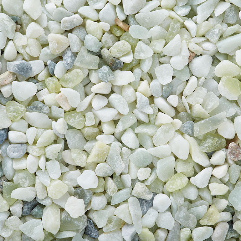
Jade Bean Pebbles 1/5″
SCENE AND COMPOSITION.
You’ve heard me use this word a lot, scene. So at this point, I feel I need to make some clarifications. A scene is a mental picture that someone who passes trough the garden gets to see at any one point. Notice how everything comes back at eye movement. That’s how designers think. It’s the technical, analytical translation of this looks good. It looks good because someone made you look at it and have the impression that that “look” is good.
I know this might be a little much for some people, but don’t worry. The rule of thumb still is: do YOU like it. You don’t need to do everything at one, and nor should you.
Do it in stages, experiment and grow as a designer. And this guide will still be here in 2 months, six months or 2 years so you can get back to it over and over again and inspire you for years to come. I purposefully made it, so everyone gets something out of it, regardless of their experience level.
But back on topic, beyond the individual scenes, there’s also the overview of the garden we need to take into account. What does the viewer see, when they first step out into the garden and take it all in as a whole. We need to consider where the eye will go each and every minute.
What’s the main event? The part of the garden you can’t wait to show off. Well, you shouldn’t be pulling your friend’s arm to show it to them, they should be instantly drawn in, move there reflexively and ask you about it.
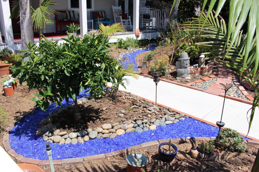
Ocean Blue™ Landscape Glass (Large ¾ inch – 1 ½ inch)
Large, red or yellow flowers are an instant draw, especially if the background is dark green. Such a scene would be spoiled if you used strong, powerful tones in your landscaping stones. So a pale row of white or pale gray river rocks would suit that scene best. Notice I don’t add another level of contrast of color, but rather I go for a toned down color and add some excitement with texture, careful not to draw away from the main attraction, so bright red bricks are not going to work in this case.
Another good way to naturally move people to your main event is with paths. But be careful, if too obvious, or straight, it can be boring. It will keep the eye in overlook mode instead of forcing focus. Angular paths with large elements are best. Not yelling out for attention but being firm in demanding attention.
The antithesis of contrast is in some way symmetry. But it’s a double edge sword. On the one hand, it’s pleasant, orderly and calming, on the other it’s monotonous, predictable and forgettable. You clearly need both.
Otherwise, it would just be chaos, which is worst even than boring. So a good rule of thumb is to go symmetric on the macro scale, calming the viewer when they first lay their eyes on the landscape and then move to more asymmetric, but still orderly arrangements on the micro level.
A good exception and reversal to this rule are when it comes to stones. If the landscaping stones are square, predictable and boring. A nice spin on the general rule is to alternate them in diagonals or even curvy sinusoidal patterns. The macro asymmetry and micro symmetry make for a very interesting scene that you rarely see in most gardens.
Rock walls
One of my favorite accents to use is the landscaping rock wall. It’s a unique compositional element that also adds tridimensionality and sets the theme, mood, and feel of the garden by being a huge draw on the macro level while being understated at the micro level.
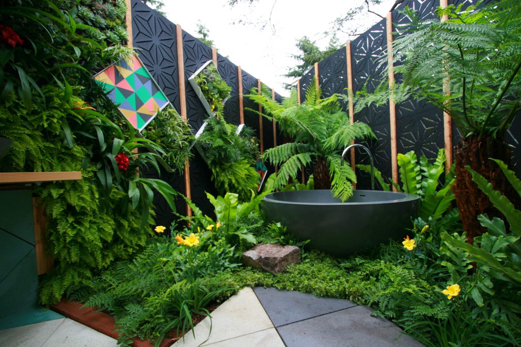
Exotic Pebbles and Glass offers incredible “privacy panels” by Outdecco to help bring privacy, style, and elegance to any yard or outdoor living space!
People will always be drawn in by the bold rocky wall, but once drawn in, it becomes just another wall, nothing special. That former bold element becomes the background for your favorite sapling or vine.
Rock walls are also extremely practical elements, Short, thick walls can substitute most patio furniture if you want, giving a more integrated feel to your lounging area, almost forcing a more relaxed, unconventional hang out. Combine this with a fire pit, and you have a very unique gathering point.
And when you want to take your garden to the next level walls become an even more unique type of accent. Remember the part about borders and unifying rocks. Well, rock walls can play the same role, but also add layers to your scenes.
You can use walls as plant beds to elevate shorter plants to eye level. You can highlight the foliage of other plants by providing a dry, lifeless background. And by using the same textured rocks, you can integrate all that into the same garden as the rock wall patio and firepit.
I admit it is a bold design element. And you should add them in stages, maybe just as a striking border next to some short, thin flowers at first. Something understated and move up from that. I guarantee that it will fascinate you how it will become your favorite design element even after you replace the flower bed a couple of times.
IMMERSIVE LANDSCAPES
Fusing the concepts of eye-grabbing design and that of functional design is immersive design. We touched upon the concept when we talked about paths. Paths are a good example of taking advantage of a function towards an estetique goal: getting people closer to the scene. If you look at a scene closer, texture, colors and mild accents become apparent. This makes the overall experience more restrained, more tasteful and adds depth to the overall experience.
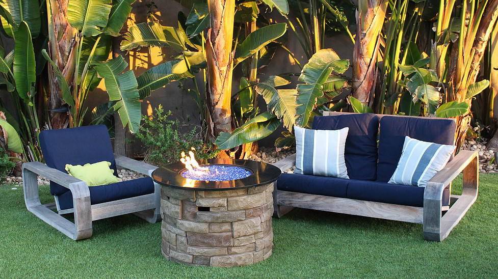
Outdoor Fire Pit – Cobalt Blue Reflective Fire Glass (¼ inch)
This works very well with small gardens or even just reformed driveways because due to space constraints the viewer is already half way into the scene. A dual zone area in the case of a driveway is an excellent application. Pave half of the driveway with bold, bright flagstones with just a little bit of texture to set the scene and the other with expansive, hyperrealistic lush greenery that reaches out and brushes against the viewer.
Layer the plant life in both height and width to create a surreal looking immersive experience under the form of a living wall. Add color accents with bright summer flowers to make it really engaging and unforgettable
Another example is the “wild gravel path.” This works best in arid themed gardens. Create a curved, diagonal, sinusoidal path trough your garden with a textured multicolored gravel that gives that natural crunch with each step. Surround it with low desert style brush, with long radial foliage, that again just tickles the ankles. Alternate the brushes with light, bold colored flowers layered horizontally and small saplings as a background feature that gives that faint woody scent.
If you’re going for a cooler theme, you can keep the main element of a “natural” asymmetrical path and add some white flagstones on a moss path. Make them vary wildly in shape and size. Border the path with thicker moss, ferns and add some flower beds with short spring flowering bulbs on some short rocky landscaping stones with a dark rich tone and rugged texture for a look taken right out Tolkien’s novels. The closeness between the rock faces and the visitor is what creates the scene in this case. It’s a great example of reversal, where the background is made of green life, and the landscaping stones ironically bring the scene to life.
YARD THEMES
I left this as my last point because I want you to start out with this. If I’ve done my job right, by now you are bursting with ideas and want to experiment with everything. But wait for a minute young Padawan.
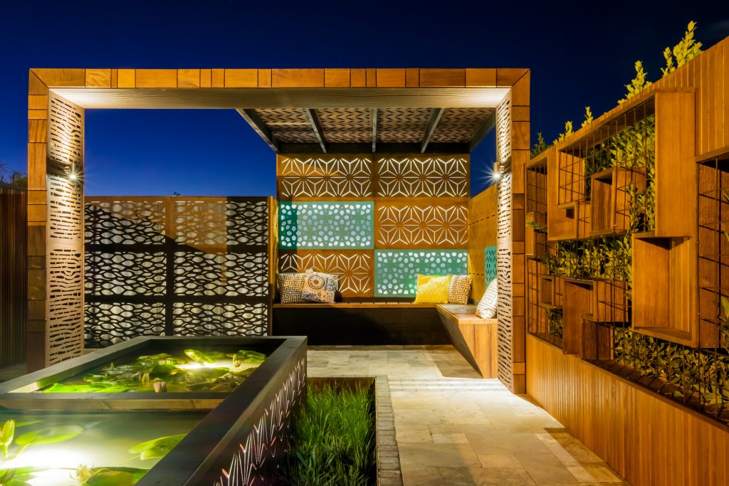
MARAKESH 24 x 48 inches – 80% Privacy (painted), STAR ANAIS 24 x 48 inches – 80% privacy (painted), LEAFSTREAM 24 x 48 inches – 60% Privacy, and BUNGALOW 24 x 48 inches – 80% Privacy
Again, restraint is where the difference between world class landscaping and amateurs is made. And the guideline of how much is too much is the theme. Now, apart from some special cases like the minimalist Zen garden or the lush tropical paradise theme, most themes are a good balance between accents, backgrounds, and highlights.
Keeping between the guidelines for a certain theme will help you prevent overkill and crowding your garden with too many attention-grabbing elements or going too mild and just having a bland garden.
Large sandy landscape rocks in Mediterranean themes work well with the short busy brush of Mediterranean plants. Continental grasses work well with small river rocks. Rugged brick walls and dry greens are great accents for the Victorian industrial look. The medieval Roman stone alley works best with massive concrete slabs, that look like they are plucked right out of the Coliseum and a bushy turf with only the occasional Japanese spurge or framed by blue start creeper for an organic background for the rocky main events. Pick one that fits your climate and grow from there. Add elements and adapt them to fit that style and play with anything that isn’t a hard rule.